Ivo is designed to be user friendly, and one of the methods of achieving this is by utilising consistent visual prompts which help you to recognise what on-screen controls do and how they behave. The following describes the icons used in Ivo to designate certain control types.
The application "ribbon" toolbar
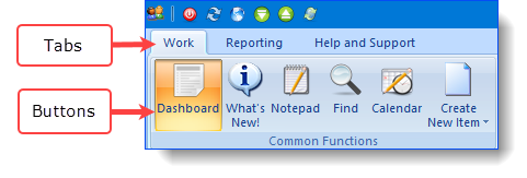
The ribbon remains in view throughout the Ivo application, and incorporates two key areas as indicated in the figure below:
•'Tabs', which divide areas of functionality into logical groups, for example, the "Work" tab and "Reporting" tab.
•Within each tab, buttons are grouped into sub-groups (e.g. the Dashboard button is located in the "Common Functions" grouping). Note that this area of the ribbon provides an indication of where you are currently working in the system, by way of the highlighted button.

Mandatory fields
In any robust information system which provides meaningful data reporting, some data entry fields must be mandatory. However, Ivo aims to assist your workflow rather than obstruct it, and as such, there are degrees of "mandatory" within the system.
Genuinely mandatory fields - those which must be completed before you can move on - are indicated on-screen by a red asterisk in the control:

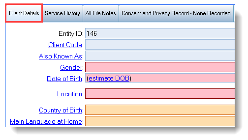
Fields which are mandatory for a client to be included in funding reports, but which are not required right now, will be brought to your attention in the client details tab. Any records for which these fields are incomplete, are classed as having "incomplete data", and will need to be completed at some point in the future. However, you will still be able to move on to another task without being forced to enter the information immediately.

Fields that must be filled in before reporting to your funder are coloured red, fields that are non mandatory but highly desirable by the funder, are coloured orange and blue fields are optional.
Hyperlinks
Any text underlined in the application features 'hyperlink' functionality, which will open another area to provide more information on the underlined text.

Date & time fields
Ivo uses 'intelligent' date and time fields consistently across the system.
Consider the date 22-Jul-2020. Any of the following entries would be accepted for this date in a date field within Ivo:
"22/7/2020"; "22/7/20" |
The common way the date would be entered |
22/7 |
A handy shortcut in Ivo - if you omit the year, Ivo will assume the current year. |
"22-jul-20"; "22 july" |
You can use the abbreviated or full month name
|
"22-7"; "22.7"; "22,7"; "22 July 2020" etc |
Use can use slashes, spaces, dashes, fullstops, commas to separate the parts of the date
|
Provided the format is date followed by month, and if specified, year, Ivo will be able to determine the date. Regardless of the format you use to enter the date, Ivo will display the date in the format "dd-mmm-yyyy" eg. "22-Jul-2020" - this ensures there is no ambiguity regarding the date.
Ivo has some other useful date shortcuts that can make your job much faster and easier:
"t" for today |
In the date field, type the letter "t" and press the tab key on your keyboard to enter today's date.
|
"y" for yesterday |
Type the letter "y" and press the tab key to enter yesterday's date.
|
"t-3" for 3 days ago
|
Type the letter "t" then "-" (minus) then "3" then the tab key to enter the date from three days ago.
You can enter "t-" any number and Ivo will work out the date that you mean.
|
Similarly, time fields behave intelligently too, for example -
Entering this...
|
Results in this....
|
|
|
2 |
2:00 PM (because Ivo knows it's unlikely that you're working at 2am)
|
2am, 2a |
2:00 AM (because 'unlikely' doesn't mean 'impossible')
|
9 |
9:00 AM
|
9p |
9:00 PM
|
15, 1500 |
3:00 PM
|
3:25, 3.25, 325
|
3:25 PM
|
Note that wherever you find a Duration field, you must specify both the Hours (even if that is zero) and the minutes. When you enter a value into the minutes field, Ivo will autofill a zero value into the hours field.
